December 6, 2008 by Vincent
Google Reader De-cluttered
Google is so into this look and feel thing lately. They first roll out themes for Gmail, making checking email more fun than ever with colorful backgrounds and cool graphics.
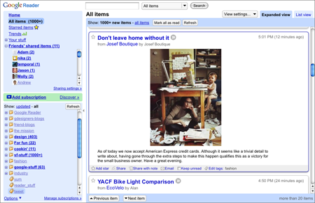
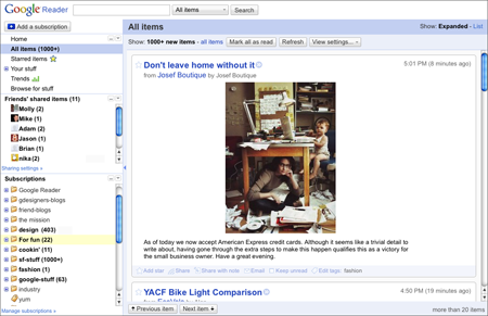
Now they have Google Reader redesigned. Nothing major, just tidying up and de-cluttering the interface, simplifying features and giving everything a bit more breathing room. Oh, and changing those rounded corners to squares.
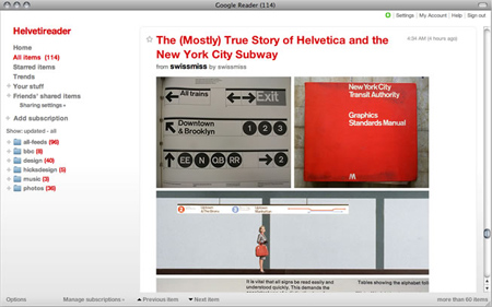
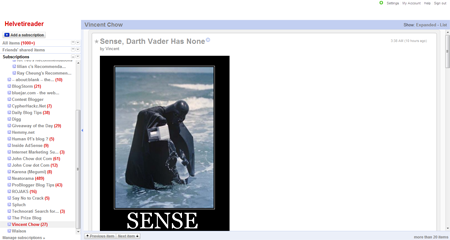
Helvetireader, a custom Google Reader theme designed for minimalistic lovers, is not compatible with the new version of Google Reader. It’s better off to disable the theme for now while the author updates it, as the new Google Reader looks way better than a broken Helvetireader.
This is how Helvetireader supposed to look like:

A broken Helvetireader looks like this:

I have not log into my Google Reader for quite some time, ever since FeedDemon goes free.


chy - June 21, 2012 @ 11:47 am
The lavishness will begin do a examine at the same time it absolutely was declared Louis Vuitton was on the most important each and every time and come through the perfect consumer encounter. Louis Vuitton Outlet established and started out this careful household across the 12 months 1921 and possesses grow to be one of several largest and popular brandnames gucci sneakers.?